Although granite may well be the first countertop option that comes to mind when contemplating an upgrade to your kitchen or bathroom, you might want to check out some worthy alternatives before making the final decision. With the myriad of ...
[Read more] about Counter-Intelligence
Blog
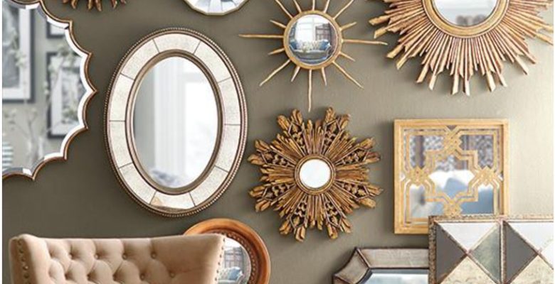
Five Amazing Mirrors and How to Place Them Like a Pro
Mirrors add so many wonderful elements to a room...amplifying light, adding texture, expanding small spaces. With the array of colors, sizes, and styles, it's no wonder mirrors can be used to solve almost any design challenge. Let's "reflect" on ...
[Read more] about Five Amazing Mirrors and How to Place Them Like a Pro
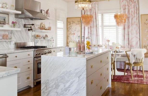
Backsplash Rules?
There’s no hard and fast rule about whether to mirror or contrast the color of your backsplash to your countertop. It really depends on the look you’re trying to achieve.
Combining similar hues creates the feel of a continuous surface, helping to ...
[Read more] about Backsplash Rules?
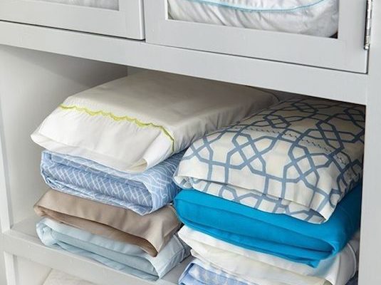
Curb The Clutter
Clearly there's a difference between "clean" and "tidy", but reducing visible clutter can help make a space appear pristine even if the dust bunnies are still looming. For those of us who are not naturally organized, de-cluttering our home can feel ...
[Read more] about Curb The Clutter