The color scheme of a space extends well beyond the paint on the walls. It’s made up of every element in the room including upholstery, accessories, flooring, window treatments, wood finishes on cabinetry, trim and furniture. Depending on the mix of hues, the same room can feel warmer or cooler, larger or smaller, relaxed or formal. Here are examples of a few universal color schemes and how they influence the feel of a space.
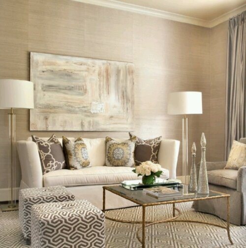
Monochromatic Color Scheme
The monochromatic color scheme is based on a single color for nearly all furnishings in the room. Sound boring? Well, it doesn’t have to be. Interest is created by introducing various tints (lighter tones) and shades (darker tones) of the main color, as well as texture and pattern. Depending on the primary hue selected, this scheme can feel extremely calm and relaxing or very vibrant and energetic.
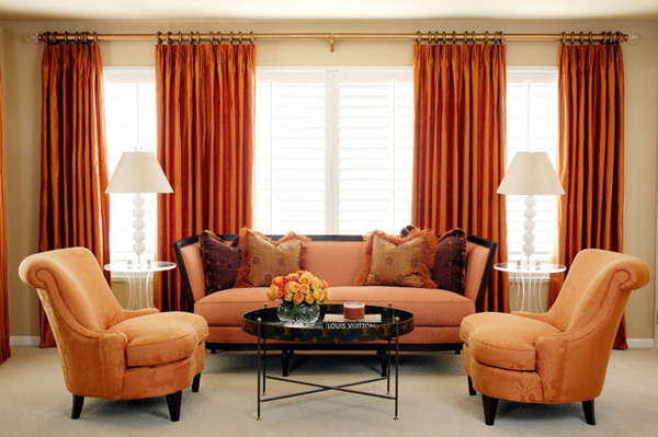
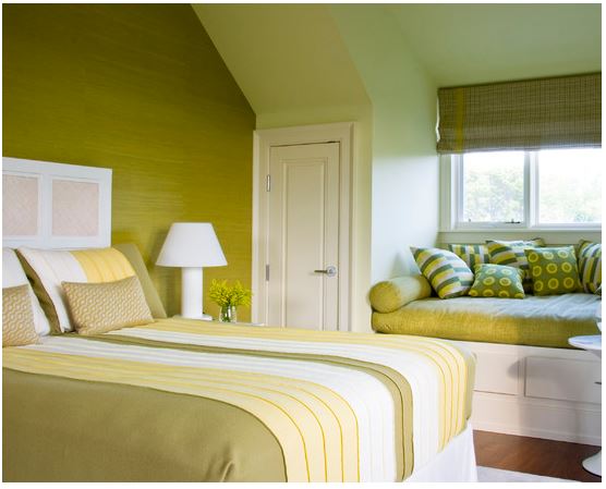
Analogous Color Scheme
Analogous schemes are often seen in nature, and combine colors that are adjacent on the color wheel. For example, yellow and green or indigo and violet. The idea is to select your dominant hue, then take a look at its neighbors on the color wheel to choose your accents. This scheme is easy on the eye so typically creates a harmonious, restful vibe.
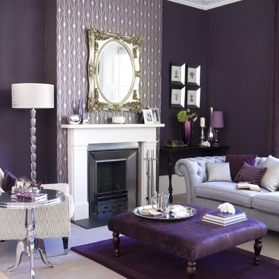
Complementary Color Scheme
Complementary schemes mix hues that are opposite of each other on the color wheel, so can produce a dramatic effect depending on the proportion and intensity of the colors selected.
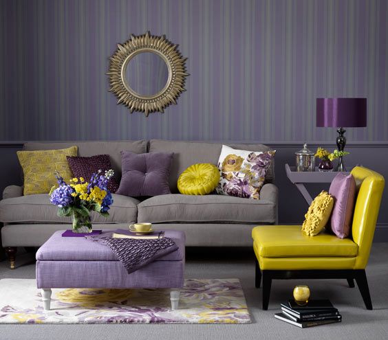
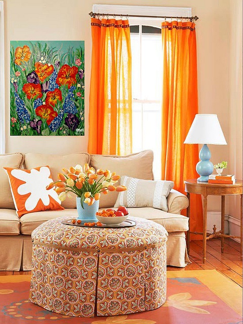
The beauty of this scheme is that combining opposite colors on the wheel mixes a warm tone with a cool hue. This blend can help neutralize the “visual temperature” of a space so that it doesn’t feel overly warm or cool, conveying a sense of balance.
Consider Contrast
In addition to color, contrast is important to consider when designing the perfect palette for your home. Larger rooms can handle vivid, contrasting colors without overwhelming the space. In contrast (no pun intended!), smaller rooms will appear more spacious if the colors are similar in intensity, preserving the visual flow of the room.
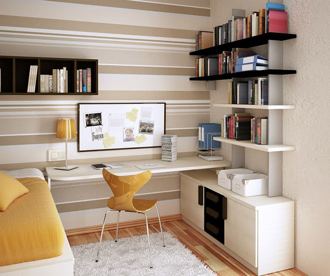
The horizontal lines of the paint treatment, desk, and shelving also help to enlarge the feel of this small space.